Kyle Curtis
Tools
Logo and Packaging Redesign
Crystal Light


Design Brief
The goal of this project was to choose a consumer packaged good (CPG) whose visual identity needs revitalization, and redesign the brand’s logo and packaging from the ground up.
I chose Crystal Light Drink Mix because it is a brand I am familiar with, and one whose visual identity seems outdated compared to its competitors and to many other CPGs found on grocery store shelves.
I wanted to revise the Crystal Light branding and packaging to better convey the product’s purpose of making a great tasting beverage that is very easy to use and has very few calories. Another goal was to modernize the packaging of the product to bring it up to speed with competing on-the-go drinks found in most stores.

Current Crystal Light Packaging
Competitive Analysis
When Crystal Light first entered the drink mix market, there were far fewer competitors than there are today. However, Crystal Light’s competitive edge was based in their product’s low sugar, low calorie formula that made it preferable to products like Kool Aid.
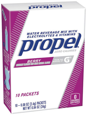
Today, there are dozens of major competitors in the drink mix market, including brands like Mio and Mio Energy, Propel, Tang, Kool Aid, Wyler’s, PureBoost, and even Skittles.
The competition has focused more on providing more low-sugar and low-calorie options to consumers, and therefore Crystal Light has lost the market share it once enjoyed just a decade or two ago.


Audience Research
At product launch, the Crystal Light brand was marketed solely to middle-aged women as a refreshing drink that was to be associated with fitness.
The target market was not changed until the late 2010s.
Today, the Crystal Light brand is not advertising, but its most recent advertisements differ in that they do not target any specific audience, gender or age.


